Straight
Chilling
Podcast
branding
the CHALLENGE
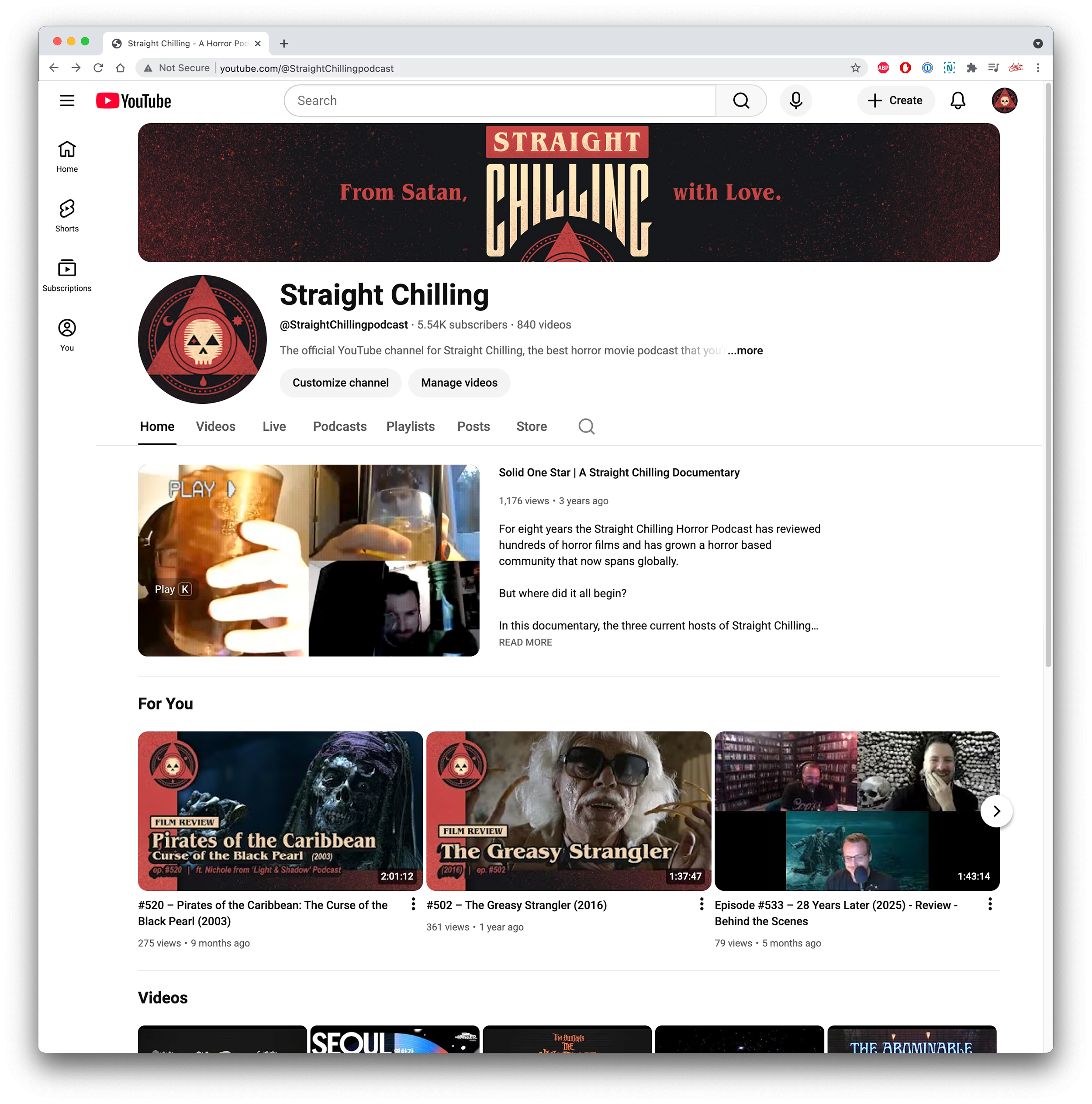
Way back in 2014 some friends and I decided to put our insatiable need to watch horror films to good use; we began a horror themed podcast and dubbed it ‘Straight Chilling.’ While we had little aspirations outside of self-entertainment, we managed over time to garner a bit of a following. This attention warranted a review of our process, as well as a second look at the early brand I had once tossed together in an afternoon.
the Result
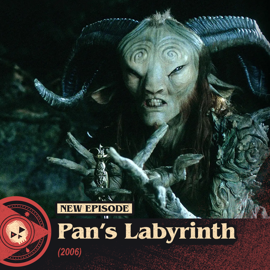
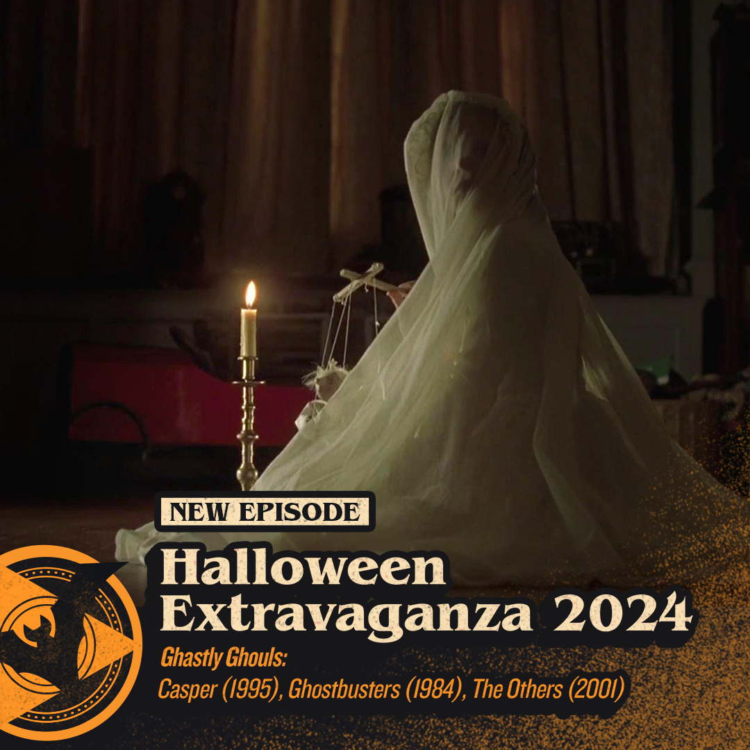
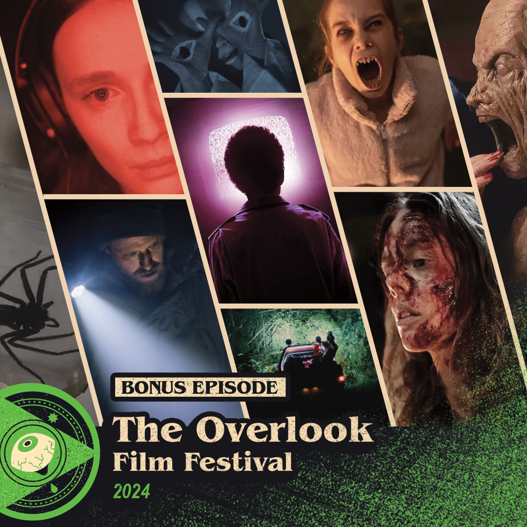
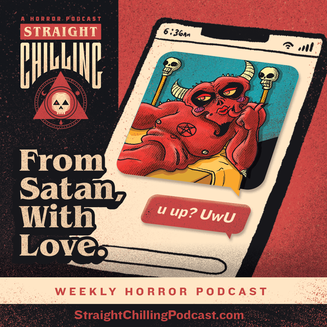
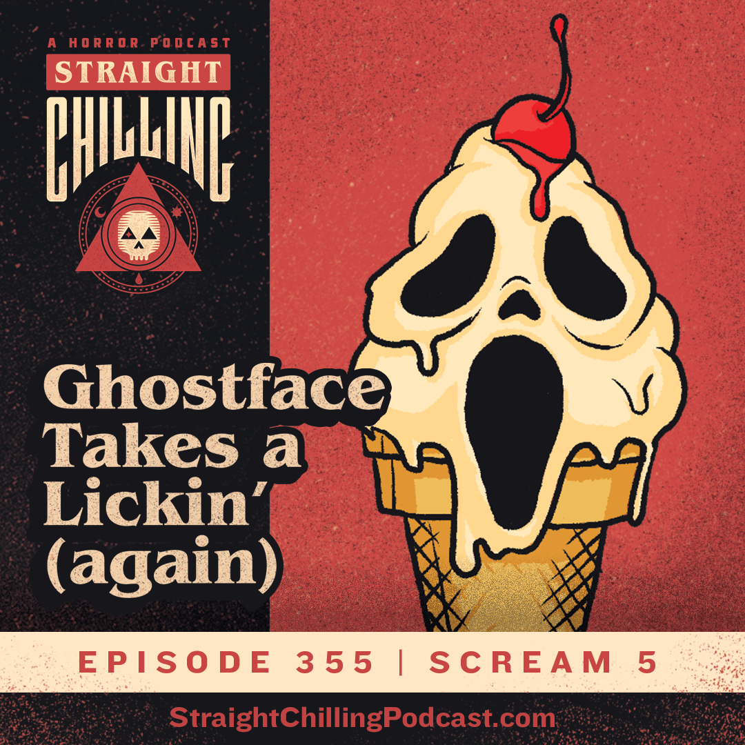
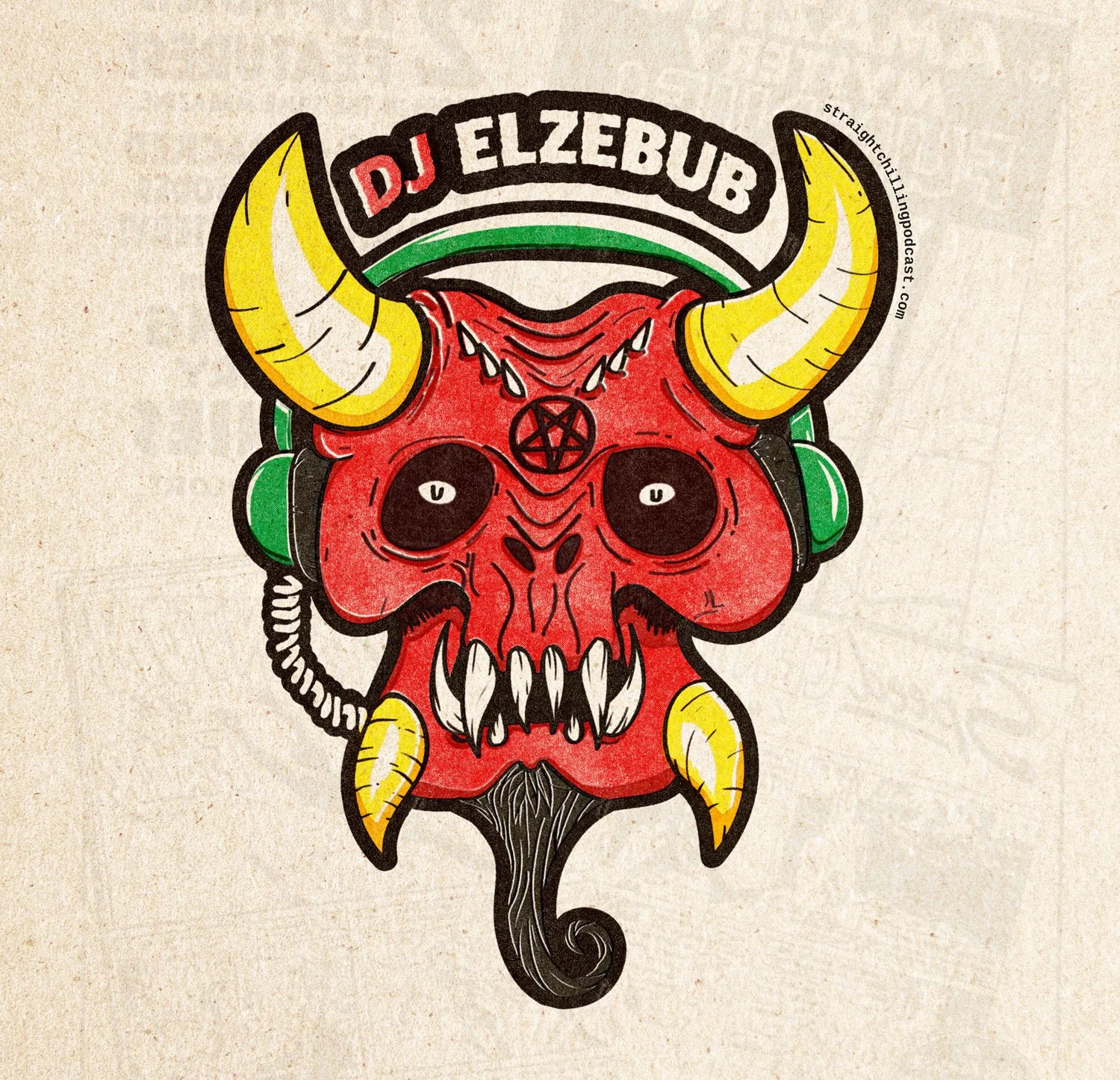
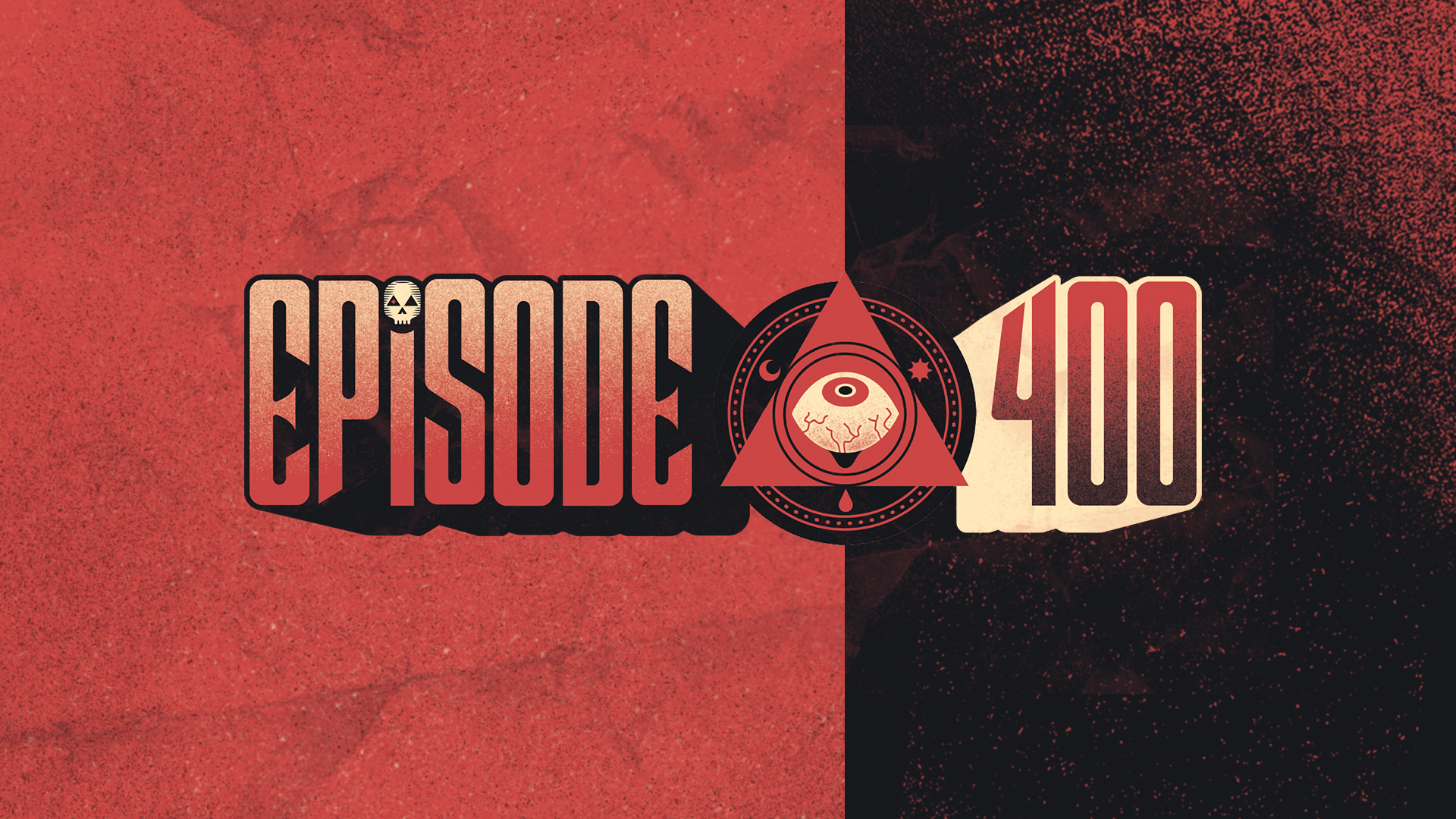
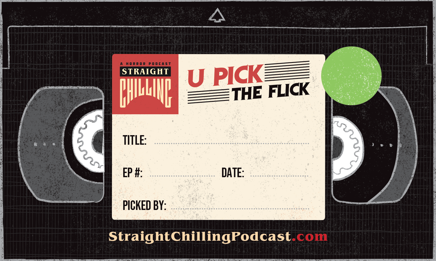
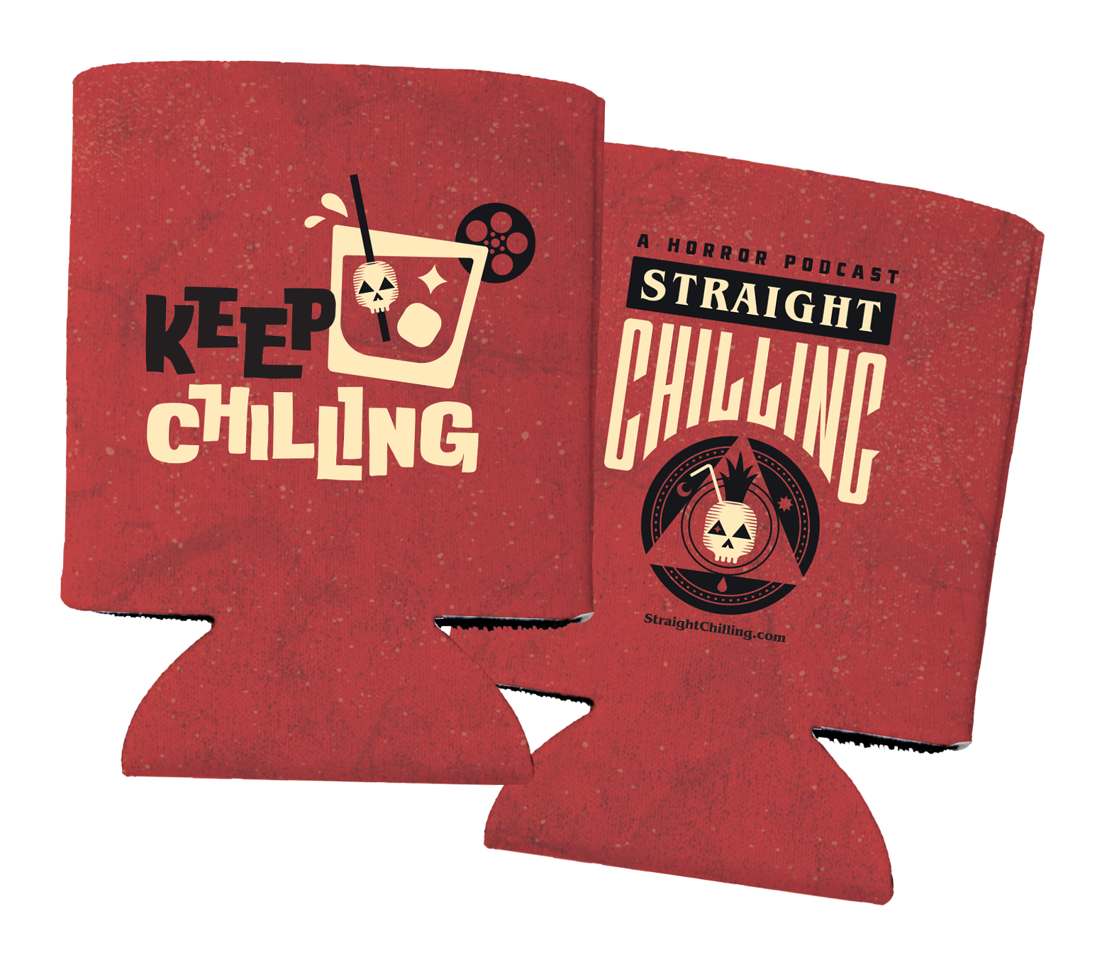
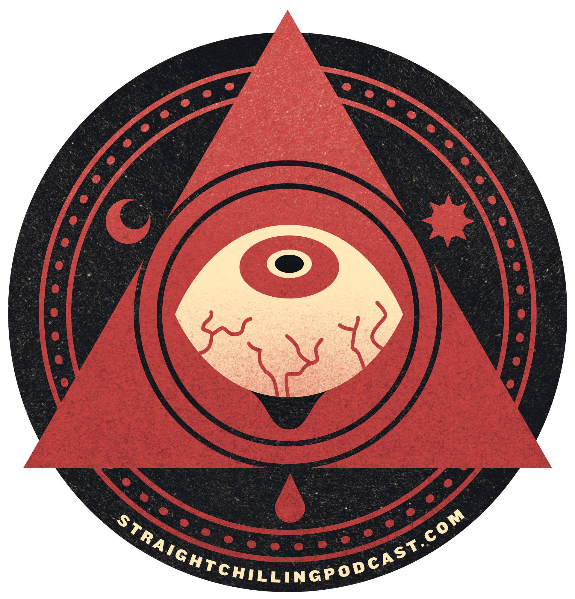
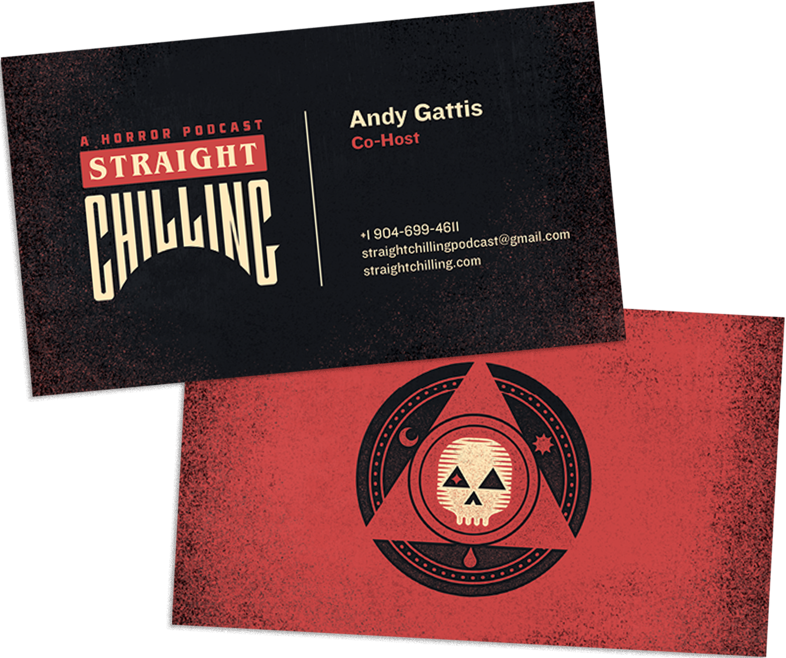
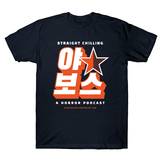
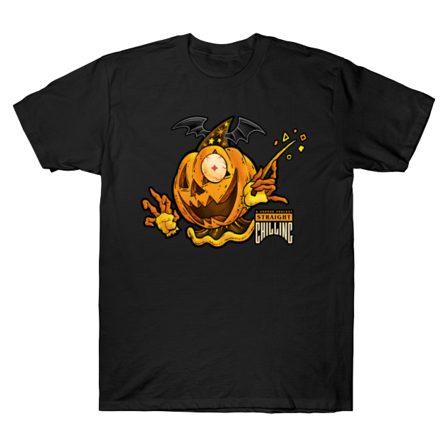
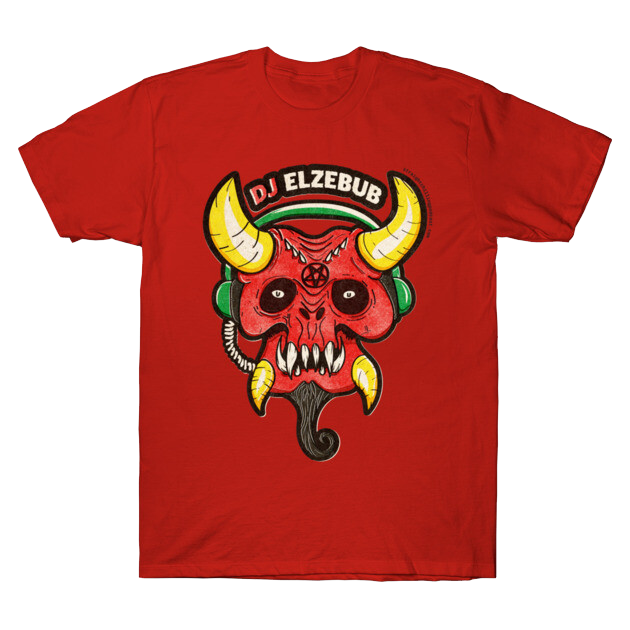
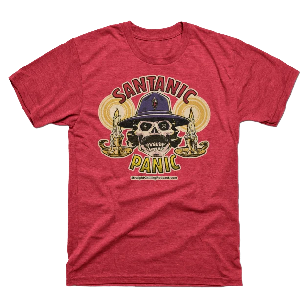
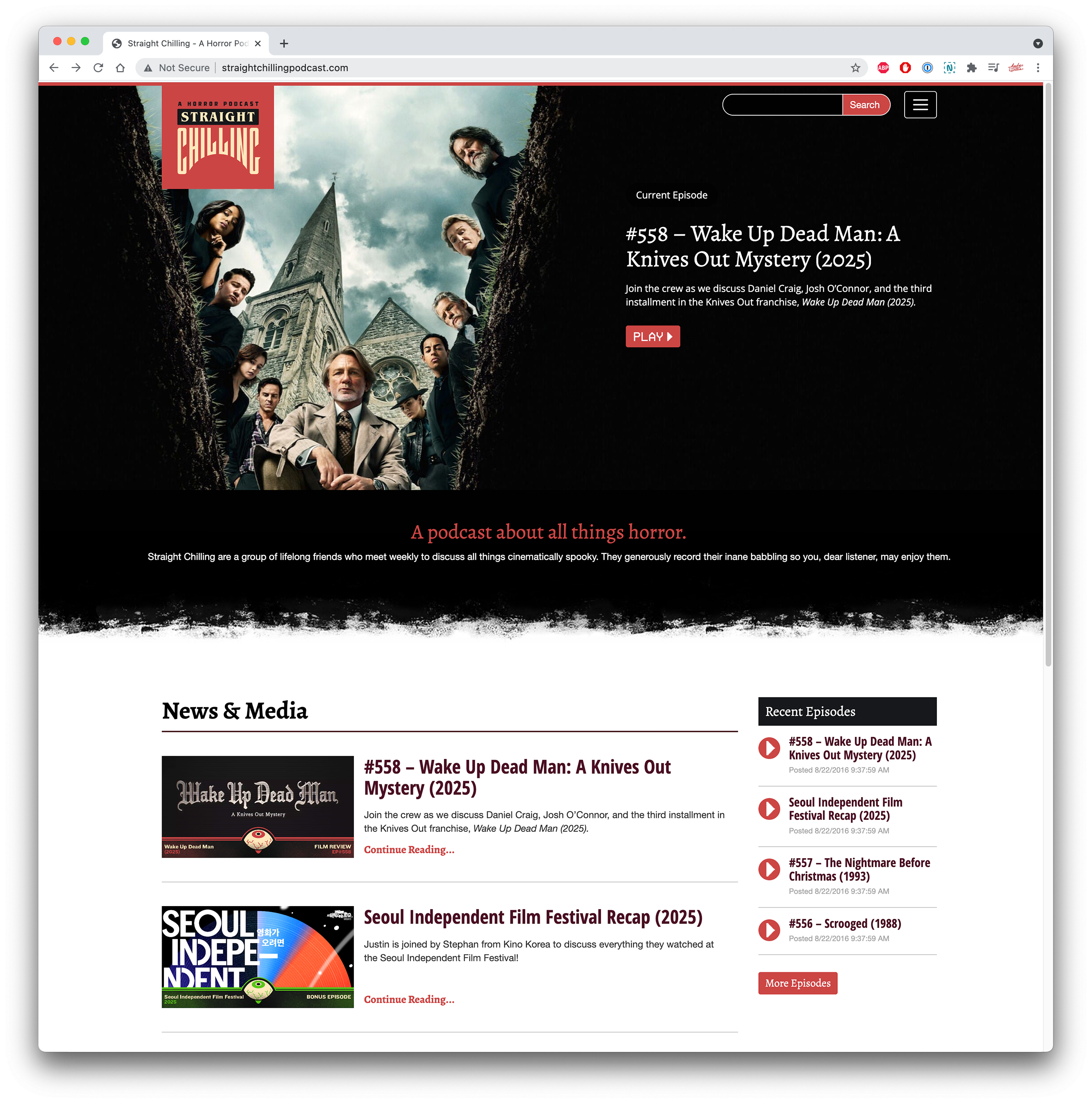
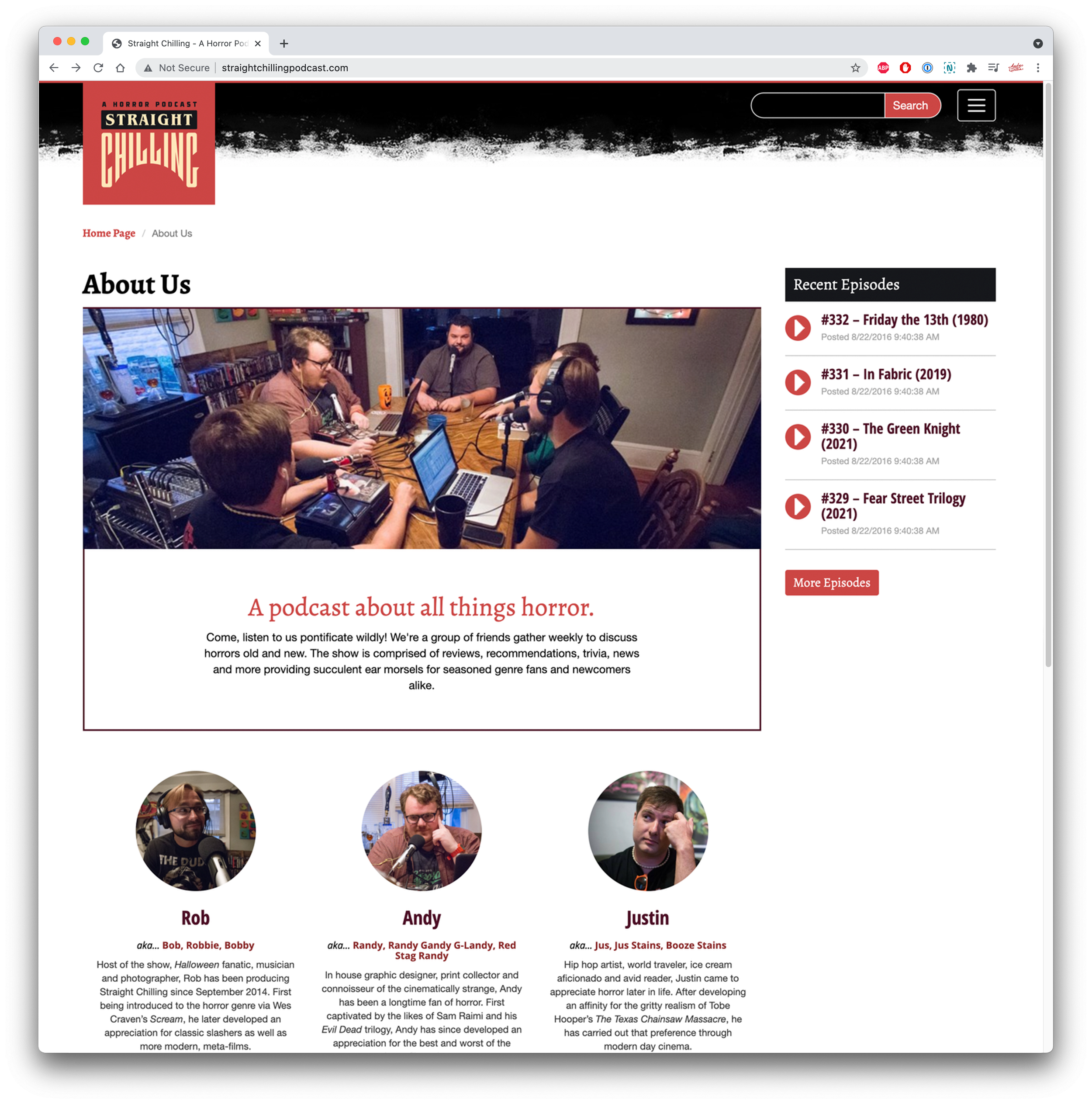
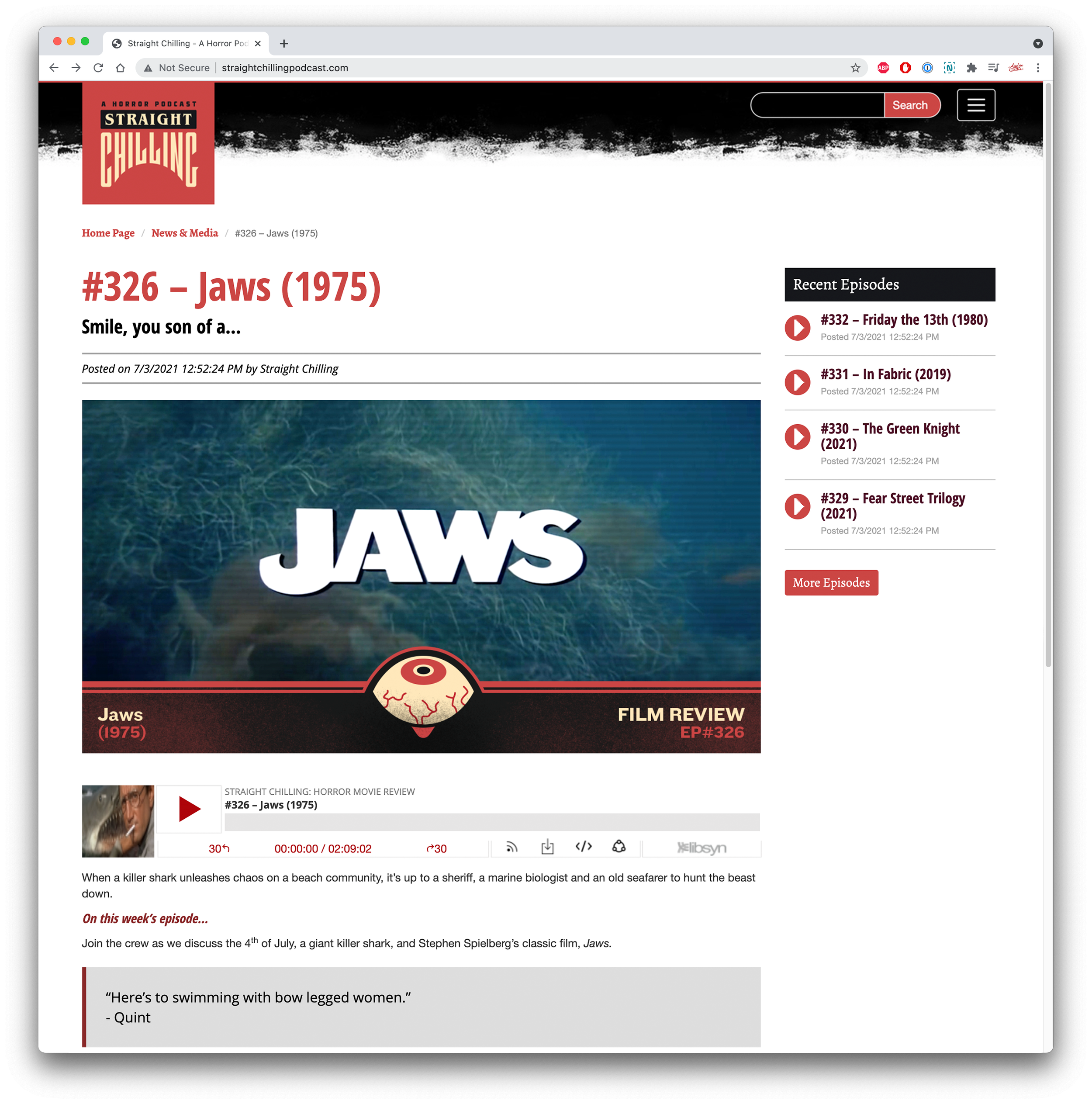
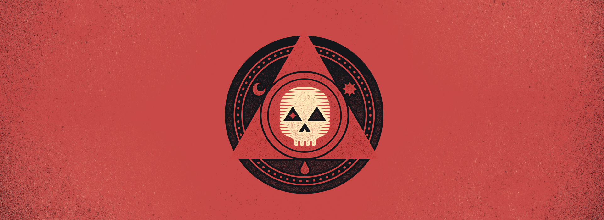
In 2016, I launched a brand refresh to coincide with a full overhaul and streamlining of the weekly show that had attained us new friends, and, unbelievably, fans (or at least listeners). Drawing from classic horror iconography such as skulls, pentagrams, and séance-inspired elements, I designed a new logo and modular icon system built for expansion and customization across special use cases.
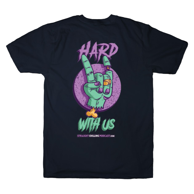
Typography was inspired by 1970s–90s horror book and film covers, resulting in distinctive serif and tall, narrow custom type treatments. The system extended to a full website, merchandise, and adaptable social advertising templates that have remained in use and evolved over several years. I also created a range of custom illustrated merchandise, including T-shirts and beverage coozies, demonstrating the system’s long-term flexibility and breadth.
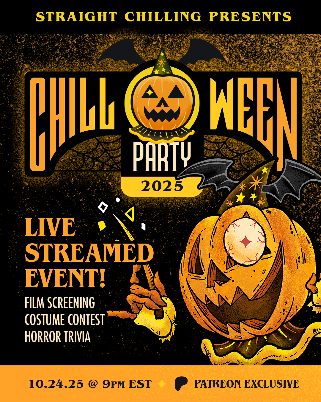
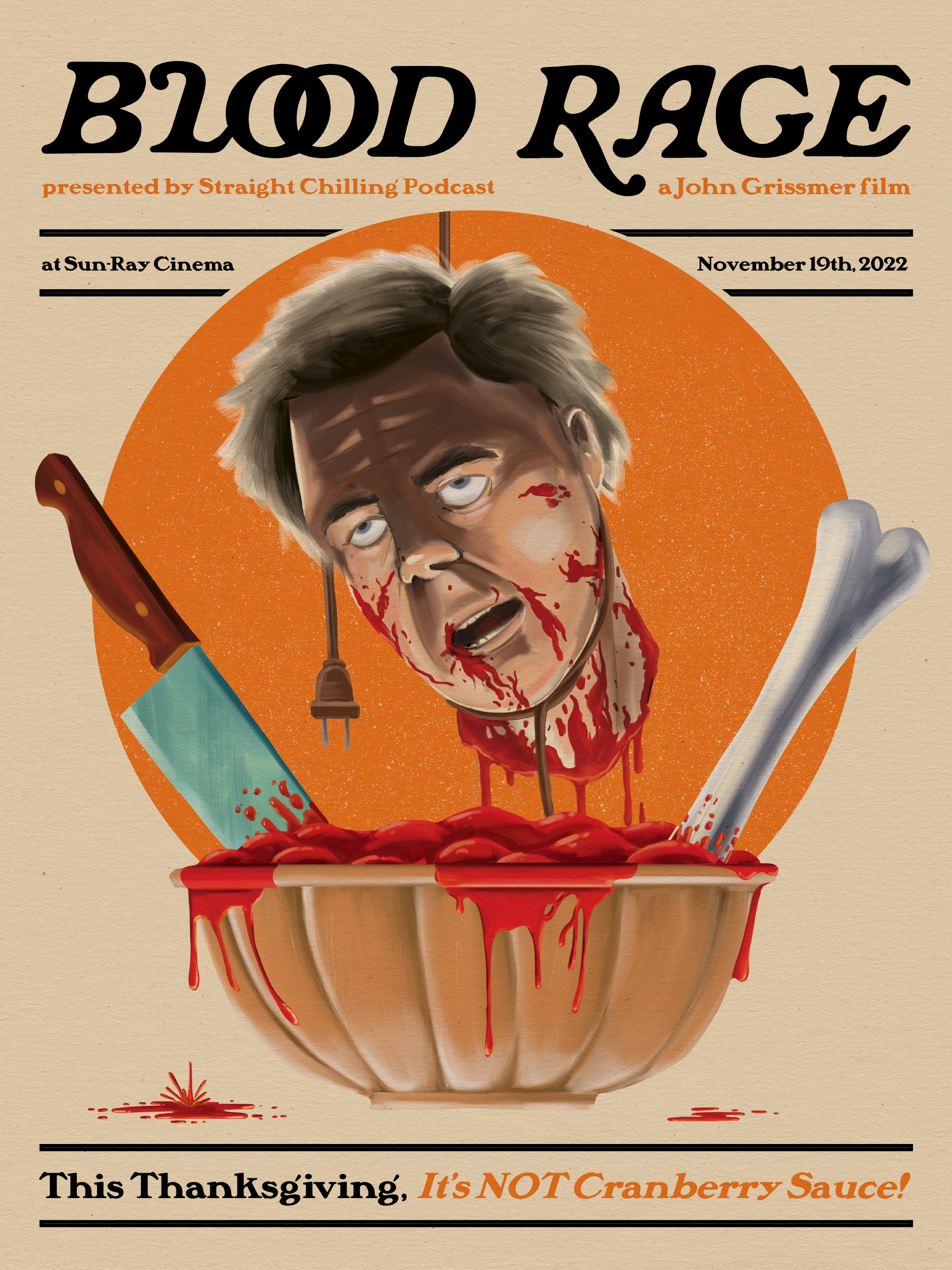
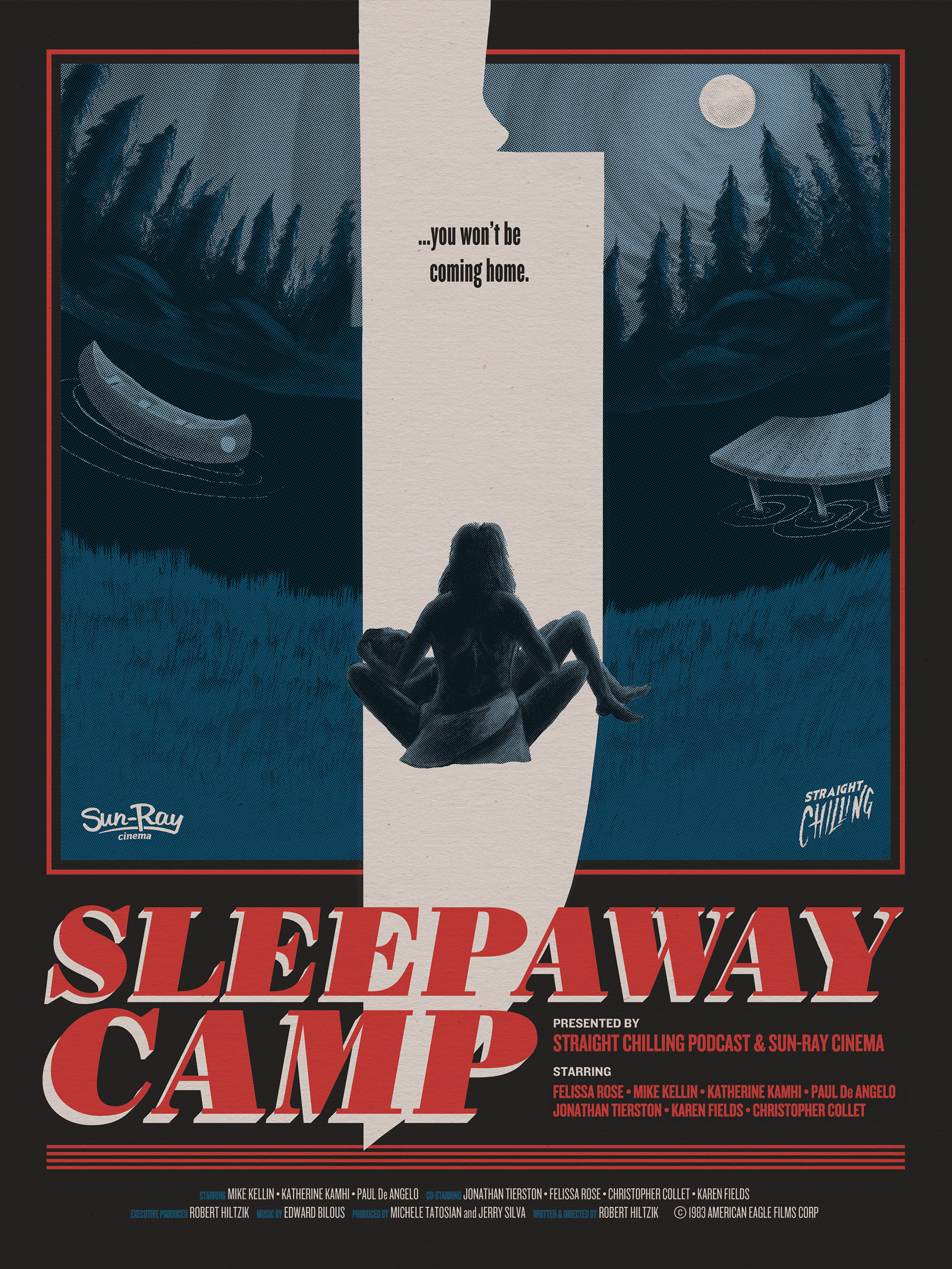
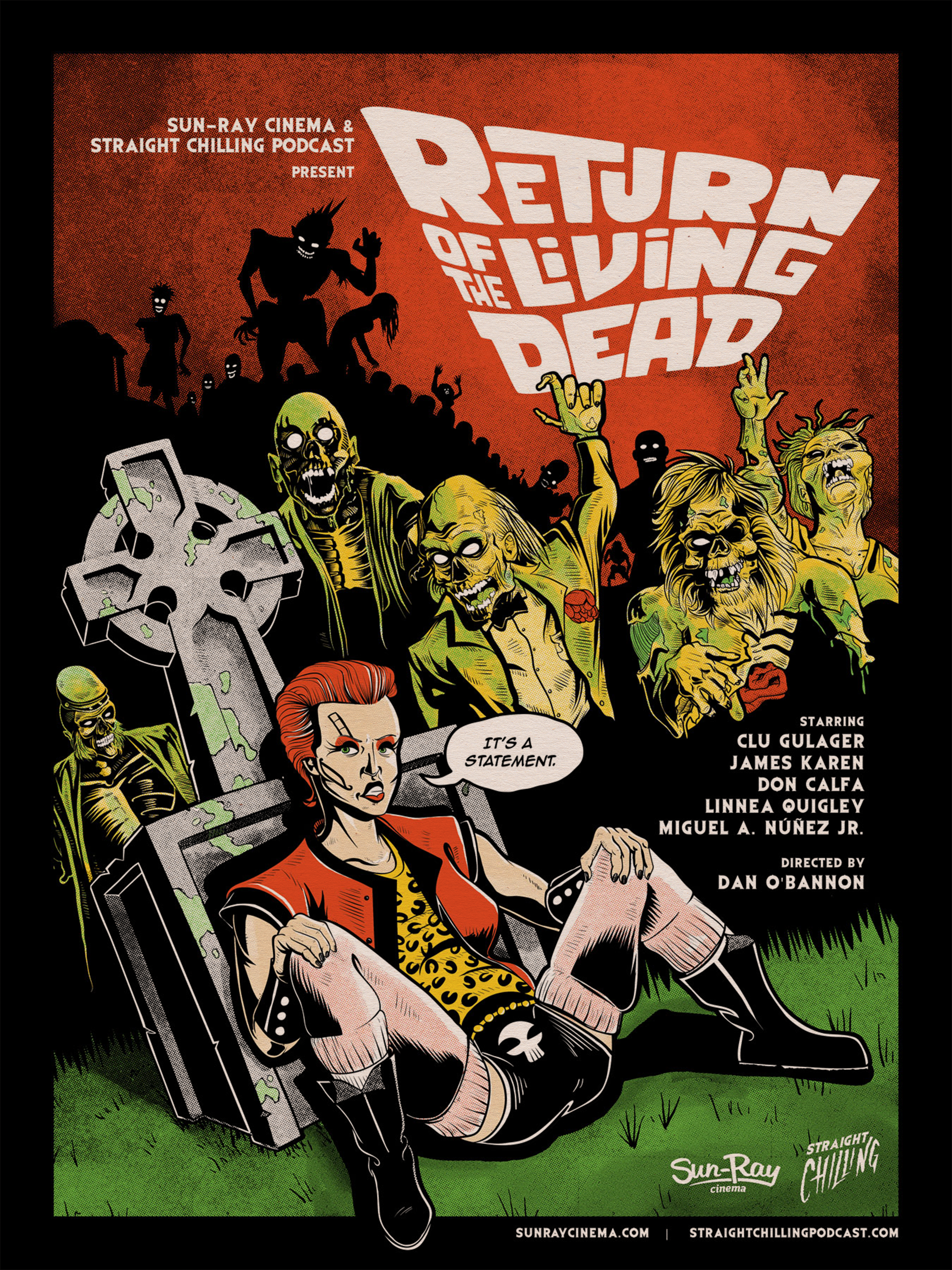
In addition we have hosted several live shows including film screenings, for which we’ve made multiple custom film posters.
Additional Notes
Client:
Straight Chilling Podcast
Co-Owners:
Bob, Jus and Myself